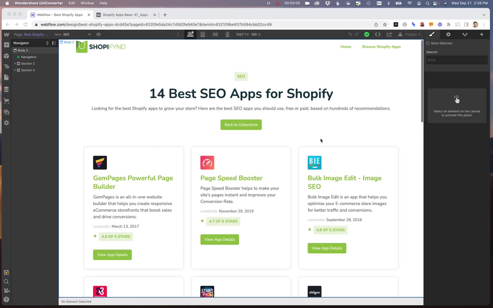
Optimizing for mobile
The lesson explains how to optimize a Webflow website for mobile devices to improve Google SEO rankings, covering breakpoints and adjustments for various screen sizes.

Get full access
You need to subscribe to get full access to the video and lesson content.
Join 6.9K+ learners from companies like Shopify, Microsoft, Tiktok, AppSumo and Instacart.
SEO Optimization: Mobile-First Approach
In today's digital landscape, optimizing your website for mobile devices is crucial for improving your Google SEO rankings. Fortunately, Webflow makes this process straightforward and efficient.
Understanding Breakpoints
Webflow's top menu displays icons representing different breakpoints:
- Desktop view
- Tablet view
- Mobile landscape view
- Mobile portrait view
Optimizing for Tablet View
To improve the tablet view:
- Adjust collection items from 30% width to approximately 50%.
- This creates a two-column layout, better suited for tablet screens.
Mobile Landscape Optimization
For mobile landscape orientation:
- Maintain the two-column layout.
- Center the content by adjusting the width slightly.
Mobile Portrait Adjustments
...
Subscribe now to get full access to the lesson content.
Get started →Get full access
You need to subscribe to get full access to the lesson content.
Join 6.9K+ learners from companies like Shopify, Microsoft, Tiktok, AppSumo and Instacart.
-
What is programmatic SEO? 00:00
-
Developing the programmatic SEO mindset 00:00
-
What you can do with pSEO 00:00
-
pSEO use cases 00:00
-
Keyword research 38:26
-
Finding datasets 00:00
-
Data scraping 00:00
-
Page templates 00:00
-
Automation program 00:00
-
pSEO images 00:00
-
Technical SEO 00:00
-
Indexing your site 00:00
-
Common pSEO problems 00:00
-
pSEO for SaaS 00:00
-
pSEO for affiliate marketing 00:00
-
Programmatic SEO in WordPress 1:17:17
-
Programmatic SEO in Wix 24:06
-
Programmatic SEO in Webflow 00:00
-
Introduction to the project 02:03
-
pSEO overview 06:12
-
Finding head terms 06:30
-
Keyword modifiers 05:26
-
Researching the competition 08:56
-
Introduction to data collection 01:07
-
Collecting data with Octoparse 11:58
-
Handling pagination 05:18
-
Signing up for Webflow 04:19
-
Webflow style guide 23:02
-
Designing the home page 15:47
-
Sync Webflow with Airtable usng Nobull 15:46
-
Importing data to Airtable 04:41
-
Clean up Airtable data 09:22
-
Using AI to create content 11:44
-
Creating a category collection 17:18
-
Creating first Webflow template 24:20
-
Creating the category pages 09:27
-
Creating single app pages 05:19
-
Optimizing for mobile 03:47
-
Adding the site to Google Search Console 02:15
-
Submitting XML sitemap 01:48
-
Installing Google Analytics 03:47
-
Project setup 06:51
-
Models and migrations 10:35
-
Create and edit link pages 21:01
-
Deleting link pages 10:12
-
Creating links 06:41
-
Improving social media links 19:26
-
Adding custom URLs 14:10
-
Link visibility and ordering 13:12
-
Creating the link page 08:52
-
Improving the UI 07:14
-
Creating a table component 05:24
-
Setting up a Stripe subscription 11:44
-
Adding dark mode 08:57
-
Improving the edit link page 15:10
-
Simple landing page 12:29
-
Improve username validation 03:38
-
Deploying the app 🎉 17:06